Non-Sibi Pro Bono Reflection
My initial understanding of the needs of the client was quite preliminary. I figured they would want a graphically pleasing poster that represents some of the disciplines of NOCCA and attracts people to audition while also getting parents interested. I came to understand that the parents are not really an issue and they are usually on board with this, but it is the student that we need to motivate to apply. I also learned that having individual disciplines would be ineffective as a student might just walk by if the poster doesn't seem like it's for them. Additionally, throughout this process, I learned about designing for a specific audience which may be different from what I think would be effective. As per the greater New Orleans and its many nonprofits finding design work is likely difficult especially if there is limited funding. From a designer's standpoint it is likely to be difficult to allocate time to pro bono work, especially with the understanding that they are not spending any money on it and if they end up not liking it could go to waste. I would love to be involved in pro bono work, and I hope I will have the resources to do it.
Posters Draft One
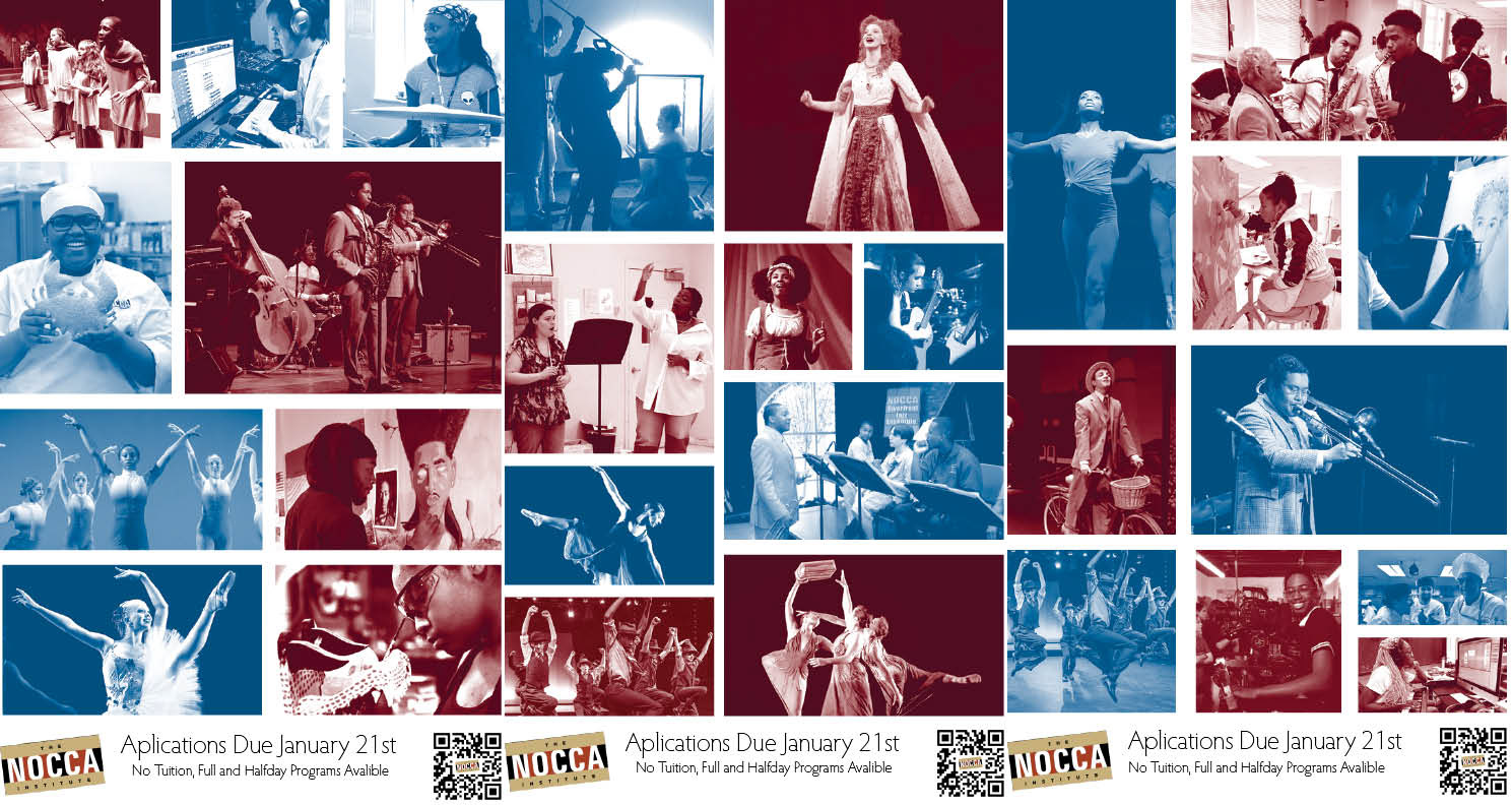
This is the first series of posters that we made. In our research, we were drawn to some posters that used duotone and we decided to employ that. We used photos from NOCCA's photo bank, the idea is that students walk by and see the photos and it makes them think "I want to be them". We then included some critical information about the application. When we presented this poster we received some crucial feedback about our type use and overall tone being too corporate for our audience. So in the next draft, we made an attempt at addressing that.
Posters Draft two
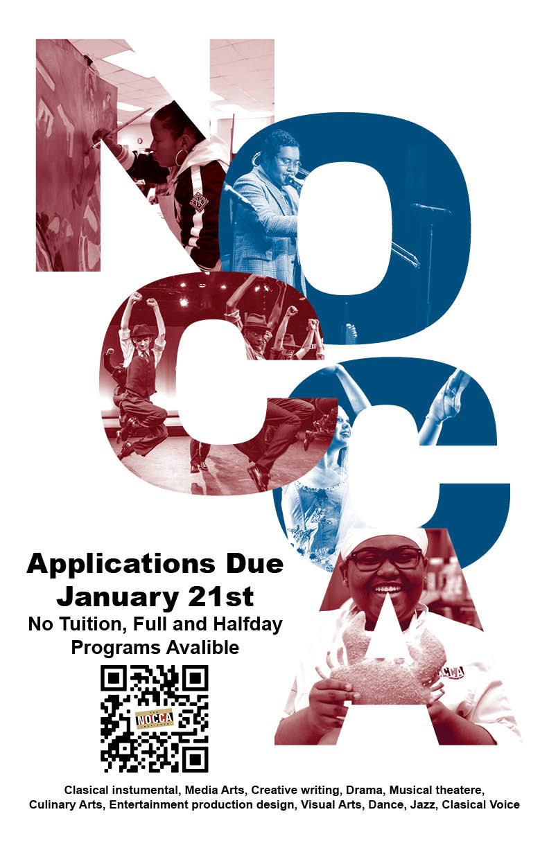
These posters used the same duotone theme as the first one but we changed the font and the style to make them more playful. We also added a list of all the disciplines. I think this poster was super effective super well crafted and looks very professional. The version with a black background I believe is particularly well balanced. These however were still very corporate and we ended up moving forward with a different idea that has some of the same energy as these two but may be better directed at 8th graders.
Final Posters

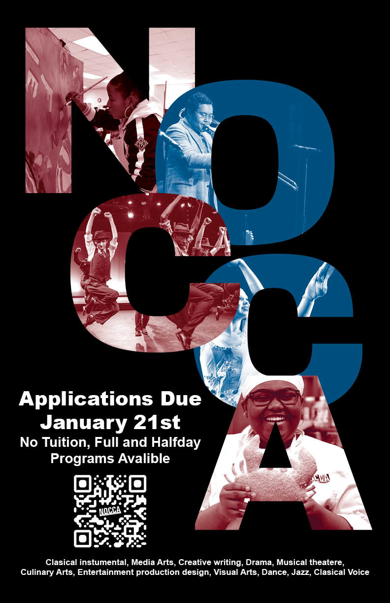
We had a major pivot for the final poster. We used the same idea of returning the pictures however we completely changed the layout. These posters much more effectively attract 8th grades than the first two employing a less formal typeface, more approachable layout, and of course, they are much more playful. Additionally, the color is also more successful as it shows more depth to the photos and is closer to the earth tones of NOCCA while also maintaining a bright and happy tone.
